Since my last progression post, I have added a block of text containing the credits for the film underneath the masthead. As well as this, I have played around with the position of the masthead and the images of the production companies at the bottom, as I didn't feel as though the position fit correctly. I felt that in the earlier images in this post, the masthead was too high up on the poster and it needed to be further down in order to let the audience see the full effect of the image.
Friday, 29 January 2016
Tuesday, 26 January 2016
Ancillary task progression two
Since my last progression post, I have played around with the position of the tag line, as I am unsure where about I want it placed on the poster. I am not sure which position will be most effective, whether it will stand out better at the top of the poster or beneath the title.
I have also added some film production company logos and awards at the bottom of the poster. From looking at real short film posters, I have noticed that they tend to represent the companies that have funded the film at the bottom of the poster, as a sign of credit for the film.
Tuesday, 5 January 2016
Short film screenshots part one
These are a few screenshots from the time lapse at the very beginning of my film, and the very first scene. I wanted to use a time lapse at the beginning of my film to introduce the title of the film, however at the moment I'm unsure how I am going to get the text onto the clip. By using a time lapse at the beginning of the film, it also informs the audience of the time of day that the film is set in. The time lapse itself watches the clouds move over the sky, and it turns from bright and sunny, to where dark clouds are starting to roll over. This matches the storyline of the film, as it begins with a state of equilibrium, and then takes a very different turn.
Friday, 1 January 2016
Ancillary task progression part one
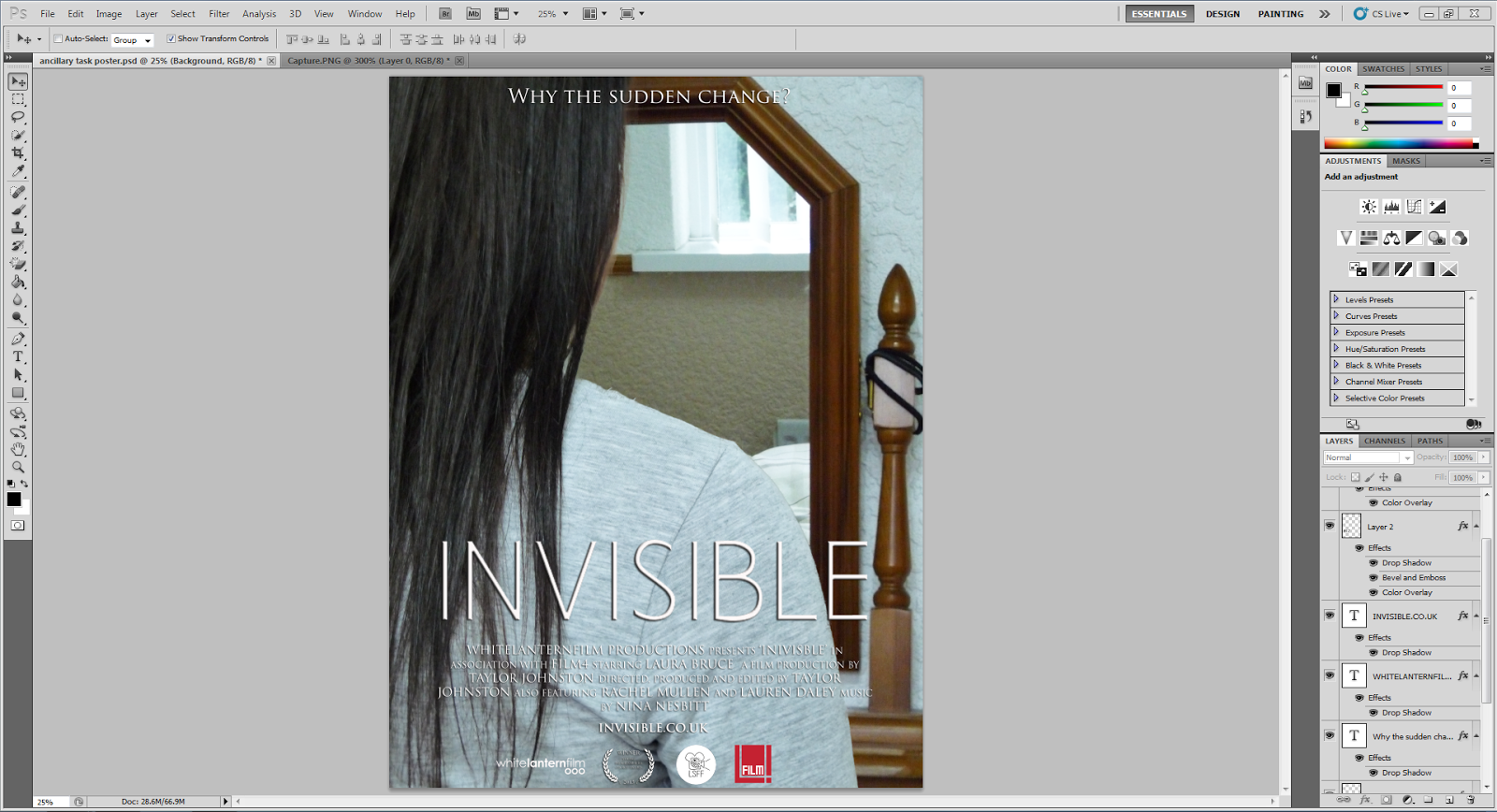
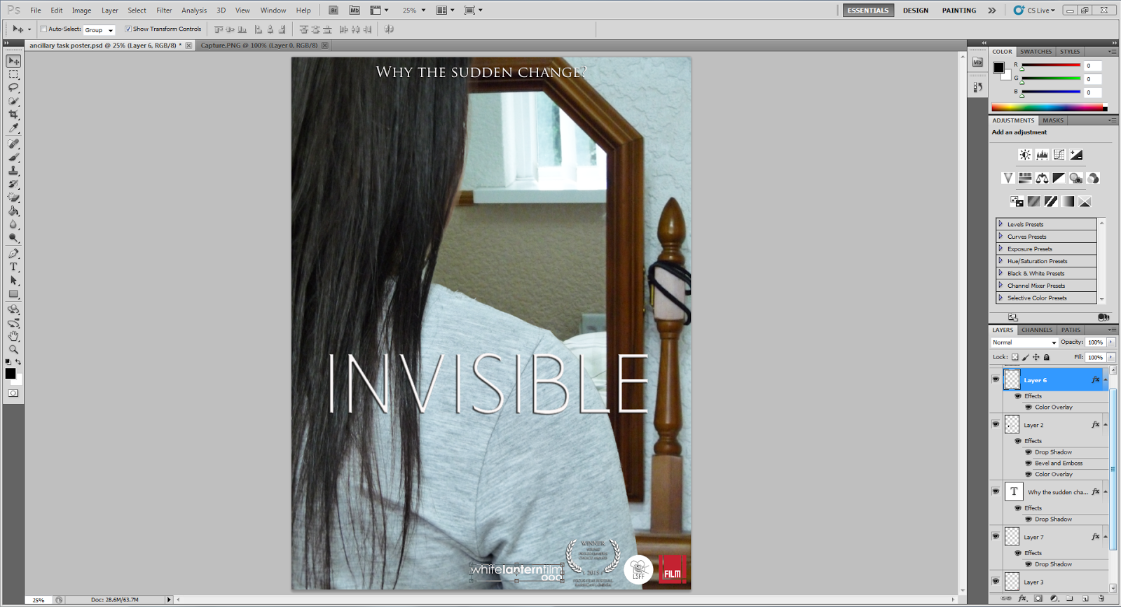
These are screenshots of my ancillary task in the beginning stages. I decided that for my poster I wanted an image of the main character, in which she is looking into the mirror and there is no reflection. This correlates with the opening scene in the film, where the character is getting ready in the mirror and notices that her reflection is not there.
To do this, I took the original image (first screenshot) and cut out the characters body. I then chose an image of the mirror that has nothing in the reflection, and pasted the cut out body onto the image with no reflection.
For my title, I used a website called dafont.com, which gives you a wide selection of choice for different fonts to choose from. I chose to have the title in capital letters, as it makes it easier to see on the poster and stands out. I changed the colour of the font to white to make it stand out from the image behind it more than it would if it was in black. To define it more, I dropped the shadow to give it a black outline around the letters, making it stand out more. I also decided to add a tag line onto the poster, to give the audience a slight insight into the film. I chose 'WHY THE SUDDEN CHANGE?' as it keeps it short and sweet, but still makes reference to the film. At the moment I am unsure of whether I want the tag line to remain below the title, or whether I want to move it to the top of the page instead.
Wednesday, 30 December 2015
Text choices for my short film poster
In preparation for creating the ancillary task for my short film, I decided to start looking for font options for the title of the film. I think out of the 6 of them, my favourites are the third font and the bottom font. The bottomn font is thicker than the other, which means that it will stand out on the poster for my film and attract an audience, whereas the other font may be harder to see.
Sunday, 27 December 2015
Ancillary task options
Before I can begin my ancillary task, I decided to create flat plans of options for my poster. I decided that to have a true representation of the film on the poster, it would be a good idea to take two photographs; a photograph of the character looking into the mirror from behind and then a photograph of the empty mirror. By taking two photos, I can cut out the part of the mirror in the image including the character, and insert a clipping from the other photograph of the blank mirror. By doing this, it can appear as though the character is looking into the mirror and there is no reflection looking back at her. This represents a scene in the beginning of the film where the character is getting ready, and upon looking up into the mirror she realises that there is no reflection.
Subscribe to:
Posts (Atom)


